
CASE STUDY: LIZI’S GRANOLA

Lizi’s Granola
A recipe for living
When we began working with The Good Carb Food Company, Lizi’s was seen as a niche health-food brand. Sales had plateaued and the business needed renewed energy and focus.
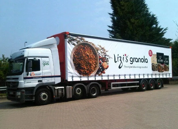
SCOPE: Brand development, visual identity, art direction, typography, packaging, display, point-of-sale, vehicle livery
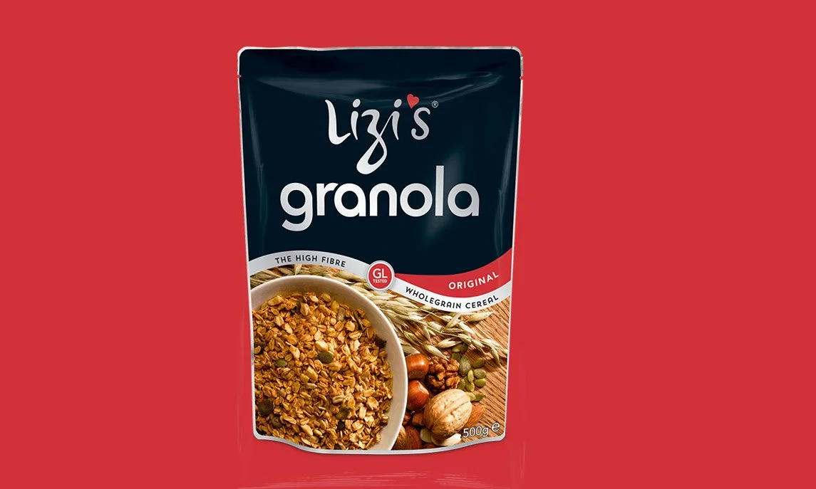
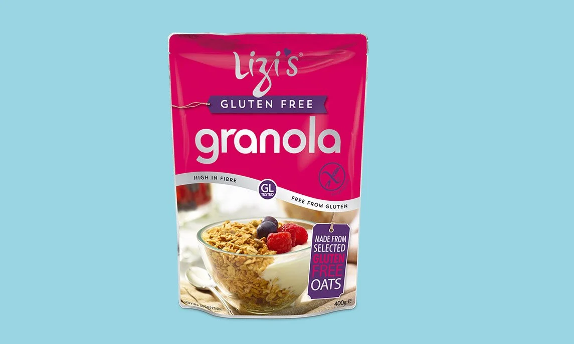
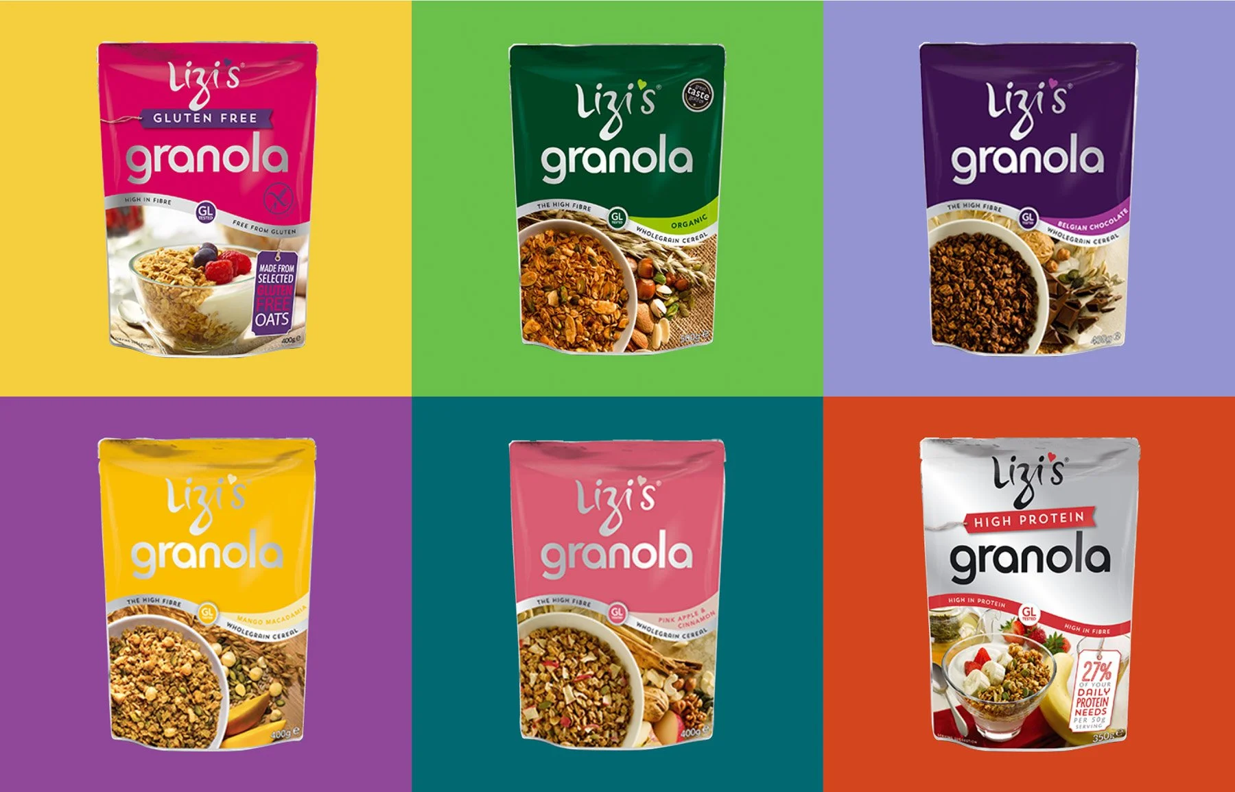
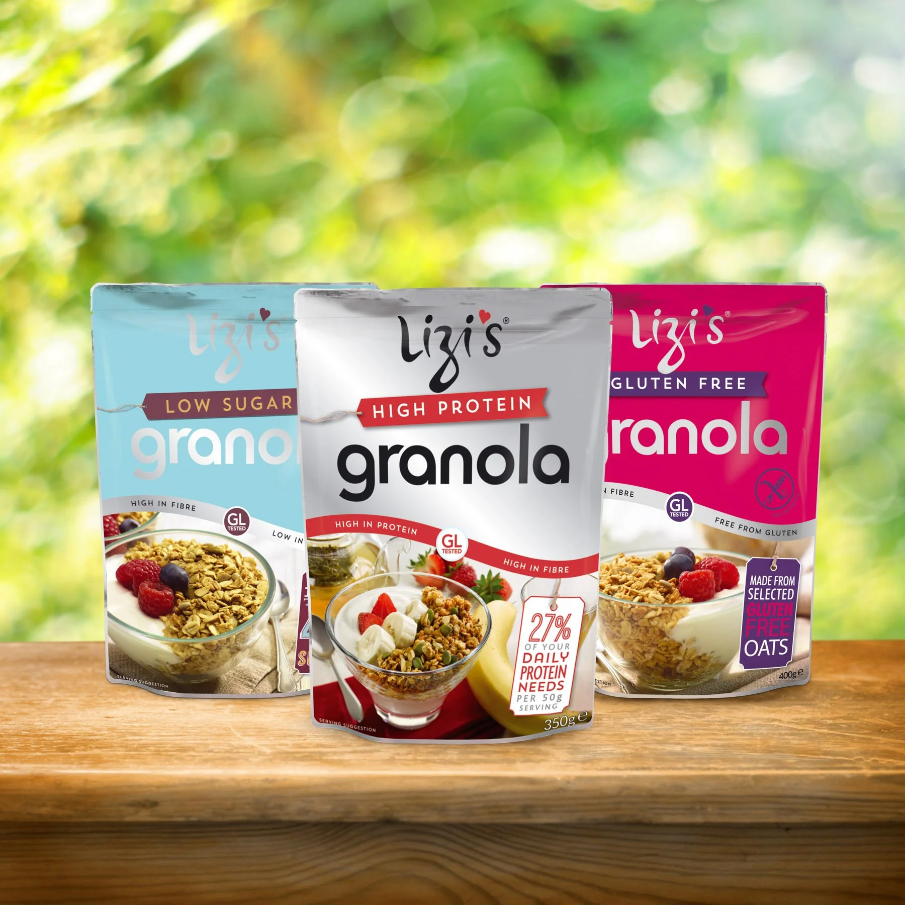
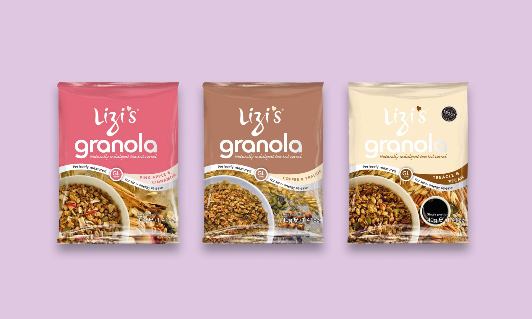
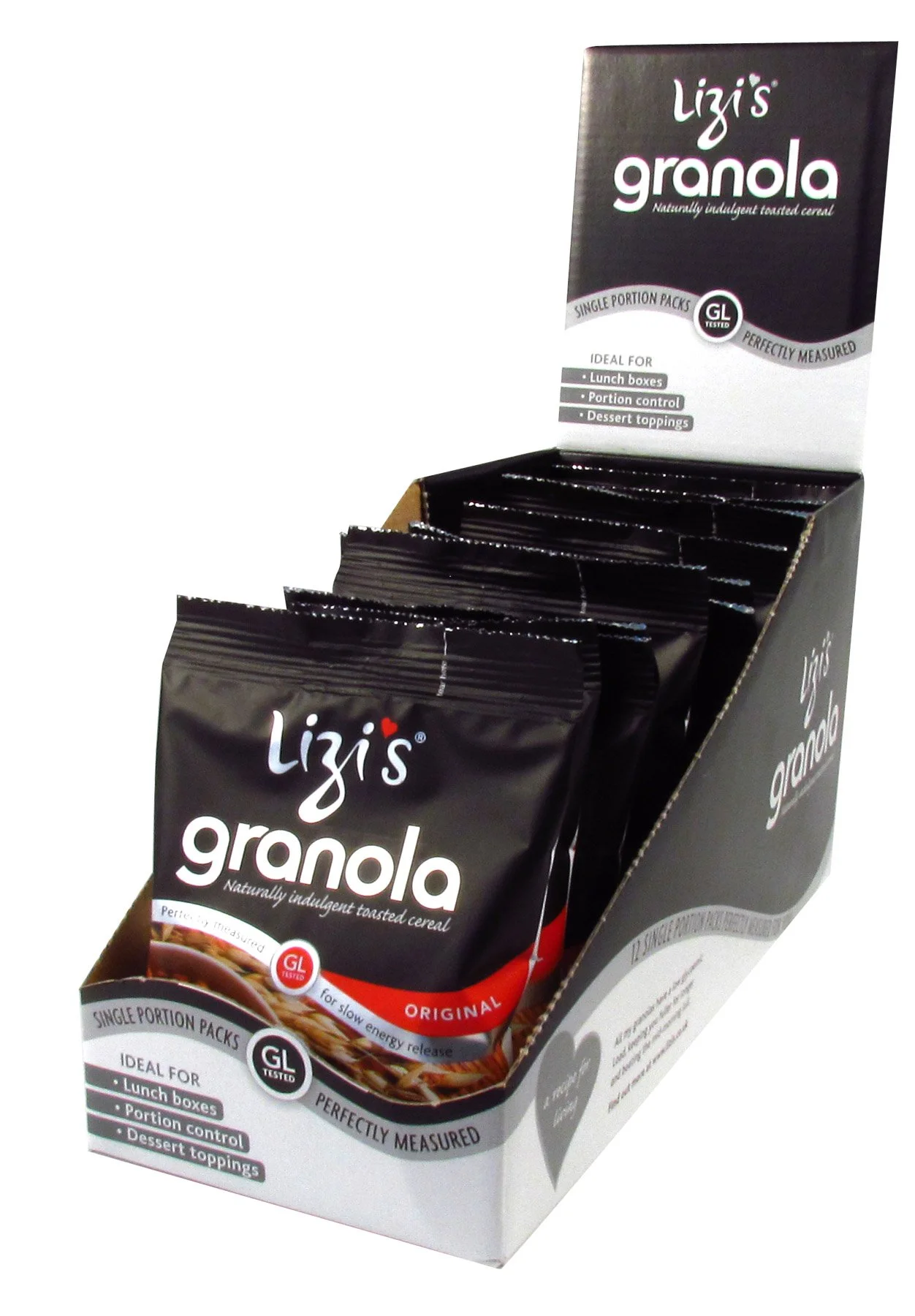
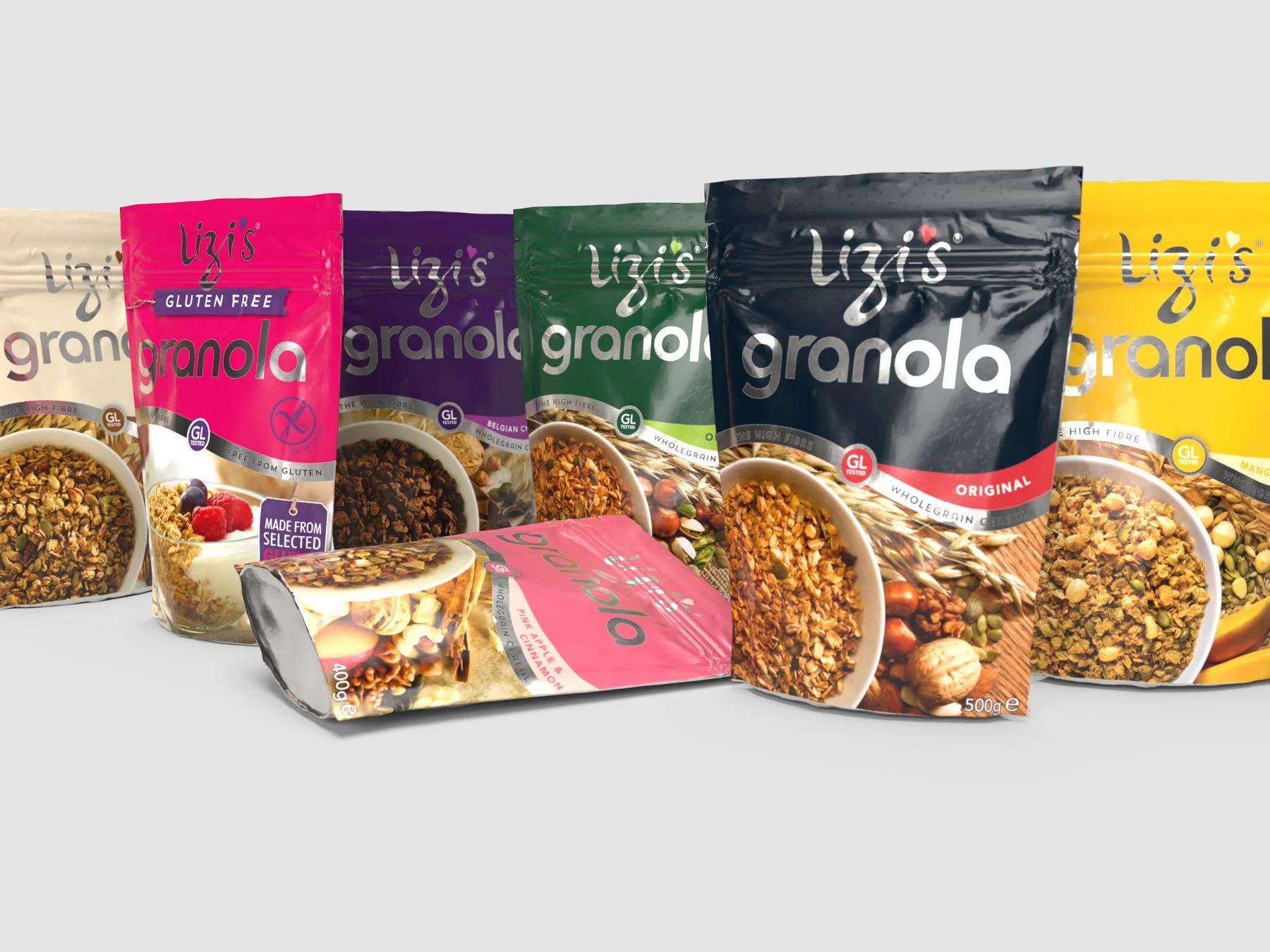
We repositioned the brand around personality and provenance, using founding partner Lizi’s name as the central brand asset. A hand-drawn logotype and bespoke alphabet brought warmth and individuality to the packaging.
We also leaned into the term “granola” — a word which is common in the US — which helped differentiate the product from traditional UK “toasted muesli.” Over time, granola has become the category standard.
Photography was commissioned to hero ingredient quality, breaking category conventions with bright lighting, sharp focus and bold colour. The result was strong shelf presence and clear differentiation.
Packaging played a key role. In 2006, Lizi’s was one of the first breakfast cereals in a zip-lock doy pack — a tactile, premium format that competitors later adopted.
Over many years, we supported the brand’s growth across new products, nutritional ranges, multilingual packaging and international markets, alongside exhibitions, advertising, POS, web templates and literature.
Lizi’s went on to become the UK’s second best-selling granola brand before being acquired by a major international food group.
Are you ready to take your brand to the next level?
Let’s have a chat — no pressure, no hard sell. Just straight, honest guidance from a team that’s helped brands evolve for decades.